Clarity
OPEN SOURCE DESIGN SYSTEM
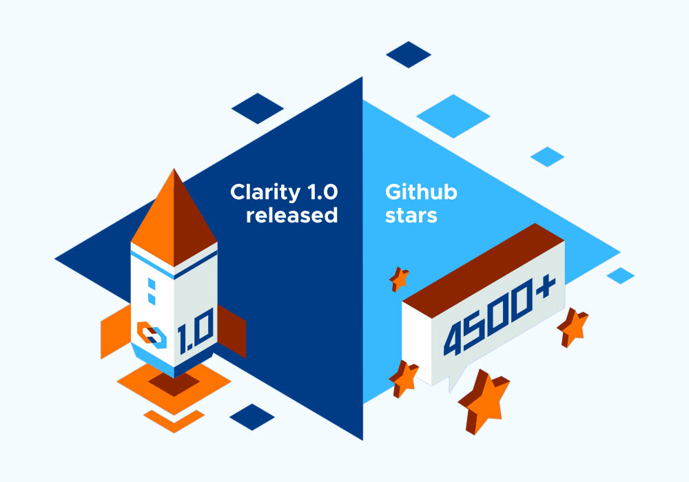
Clarity is our design system at VMware, built in-house and available open source. We offer Clarity in 2 flavors. The original is Clarity Angular, launched in 2018. The newer version is called Clarity Core, which is built with web components as a javascript framework agnostic alternative. Most products at VMware use Clarity NG and we continue to support it, but all innovation is being done in Clarity Core where I have focused most of my recent efforts.
To get right to the actual work, take a look here at Glarity Core Storybook and a couple articles discussing the underlying concepts and principles:
My Role
As a Senior Manager on the Platform team, leading Clarity Design, I work closely with development, research and accessibility creating new components, patterns and interaction models, along with adding enhancements to existing resources. We maintain the documentation and libraries as well as providing visual design support for the entire design organization. As the team grew I added management to my responsibilities, allowing me to Lead Design and delgate and guide resources. I provide direction, critique and approval for all Clarity design.
The remainder of this page (below) is a review of the enhancements I made to Clarity Angular after launching 1.0 several years ago. For current work I suggest Clarity Core Storybook.
TYPE
At top of my list was our open source typeface, Metropolis. While providing us with exceptional value given its similarity to the typeface VMware uses in brand and marketing, it suffers from shortcomings due to its provenance from an independent type designer, rather than a foundry. These included uneven kerning pairs, migrating centerline, optical massing and join problems, as well as many missing glyphs. Designers were unhappy using this typeface and I empathized with their frustrations. I made it a priority to elevate the face to higher standards. The typeface known as Clarity City was born.
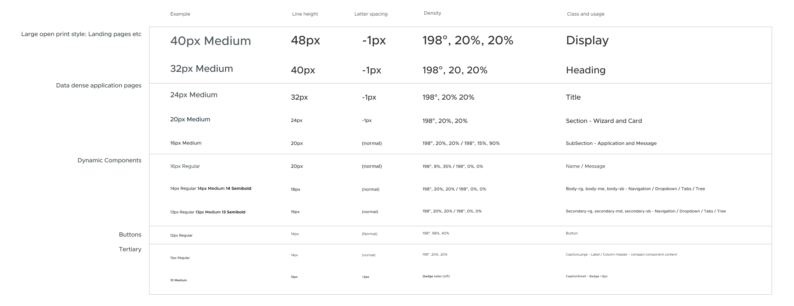
For our type system, I addressed the hierarchy concerns in the existing type scale. The sensibility for Clarity type classes was very light in weight and density. This resulted in applications with flat hierarchy. I reviewed usage with product teams and in our components. The most extreme examples of confounded hierarchy exhibited as many as 15 separate sizes and weights in a single screen. I created a system with a limited number of choices along with usage guidelines.
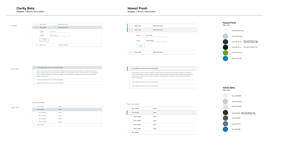
Original Type system: low contrast, minimal hierarchy, irregular line heights
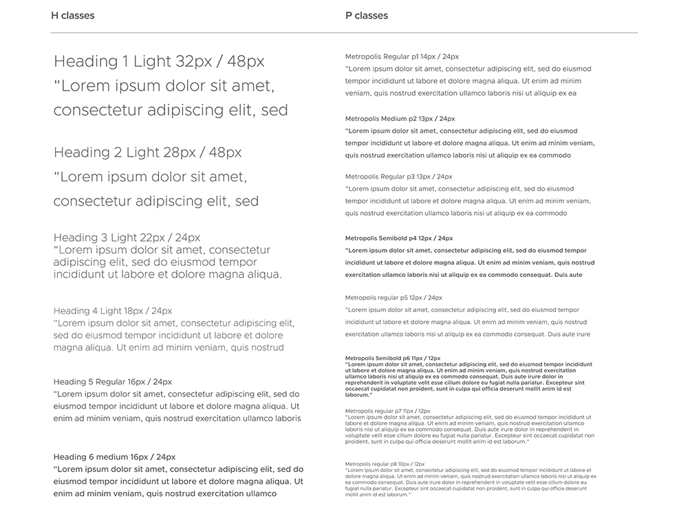
Type System: revised for greater hierarchy
After several rounds of options, working sessions, and review it became clear that we had 2 concerns. These were open layouts such as landing pages etc. and tightly packed information pages that require information density. I added weight and size to the display classes, and distilled the complexity in the middle and small sizes. I shifted to color from neutral to cool grey and created a template system to assist in achieving hierarchy. The increased dynamic quality of the resulting screens was well received, more usable, and more attractive.
Templates:
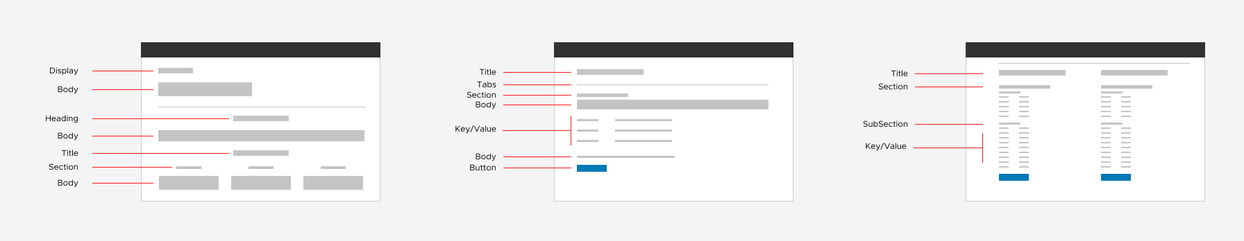
Examples using the updated type system:


COLOR SYSTEM
The initial designs for Clarity were lacking in chroma and contrast. We needed blacker blacks and whiter whites, more saturated color. Before going down this path I interviewed designers across product teams to validate my observations. They validated the notion that increased chroma and contrast were needed.
I changed our color model to HSL and created a UI palette using the brand palette as a foundation. By finding all the complimentary hues then using the saturation and lightness channels to calculate tints, tones, and shades, I was able to achieve a harmonious collection that both reflects the brand and is suitable for UI. This includes a set of utility colors users with vision impairment.
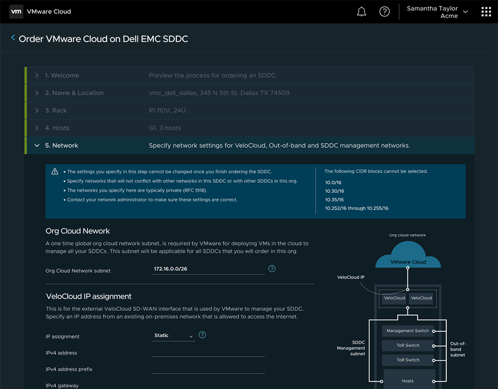
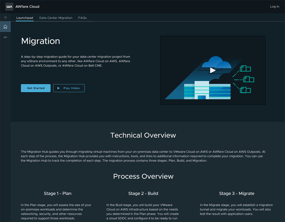
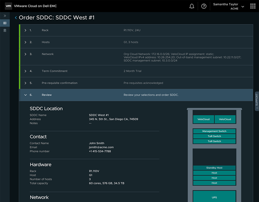
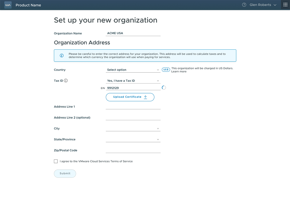
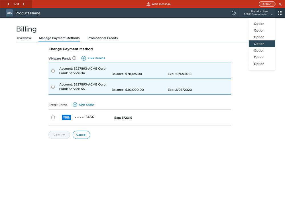
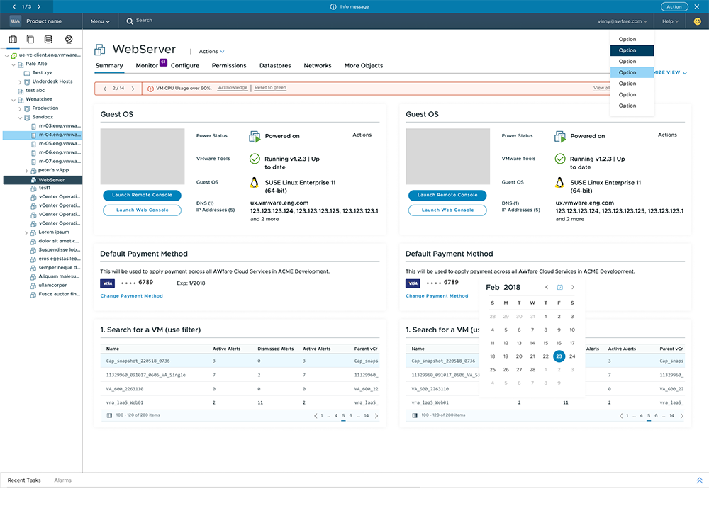
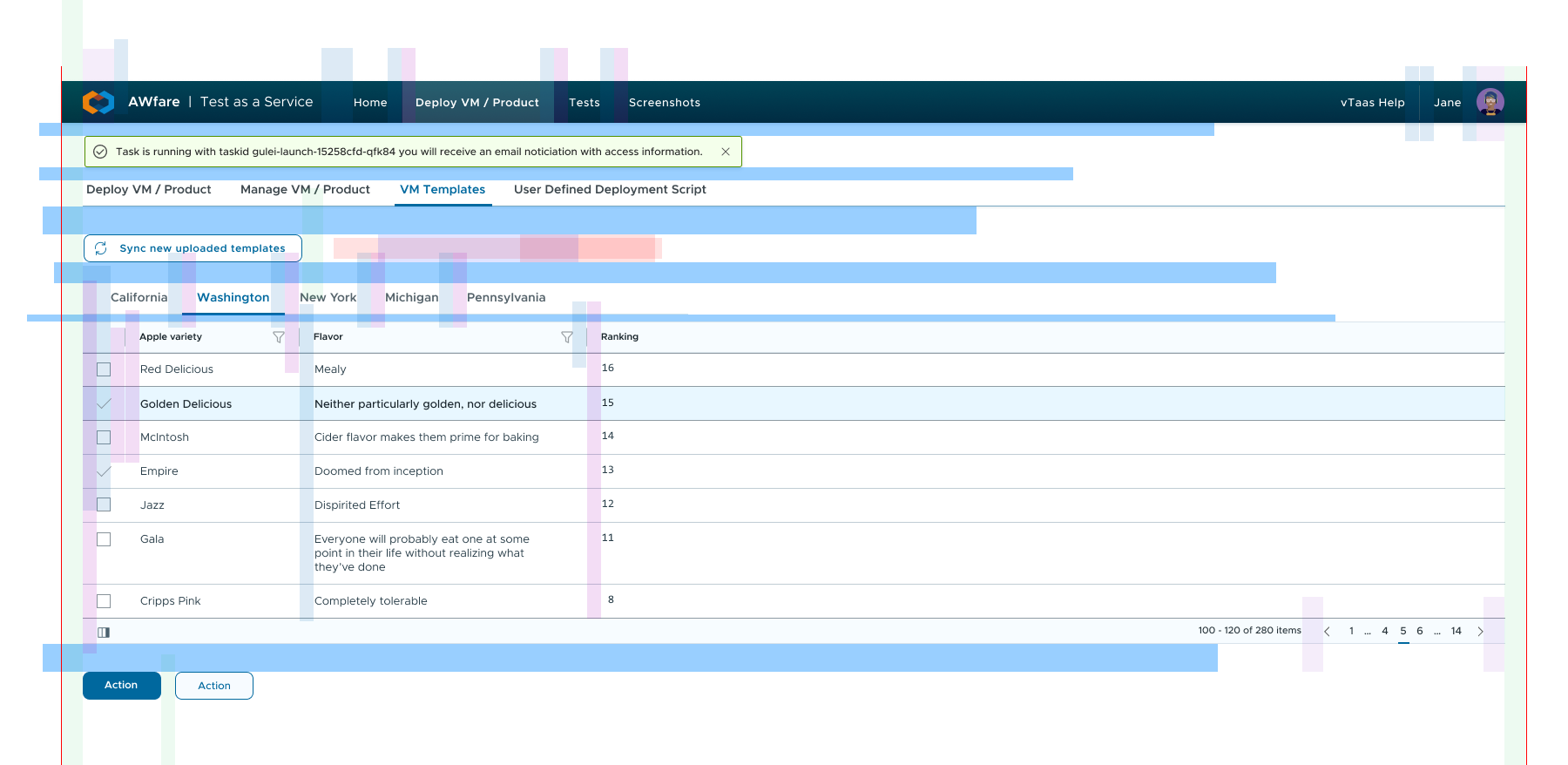
Existing product screens using new color system:
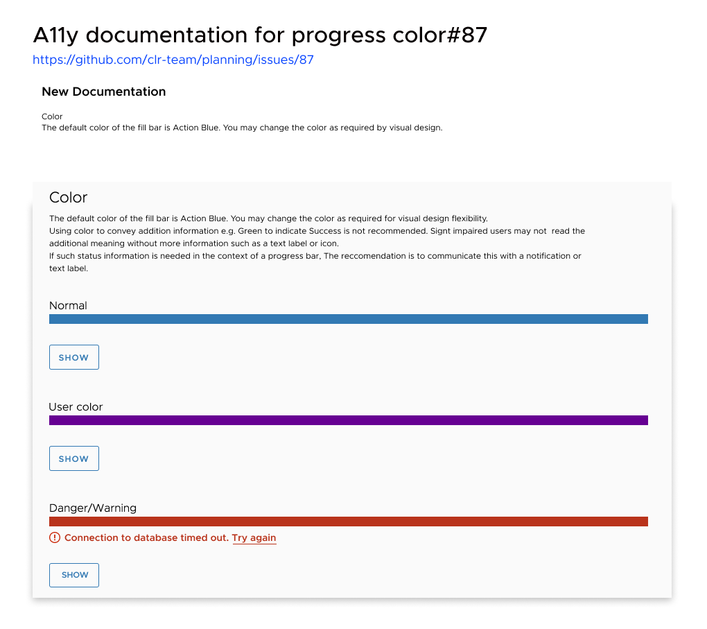
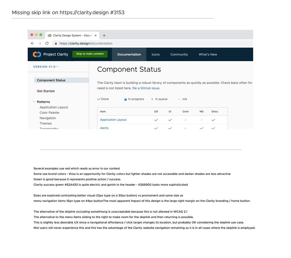
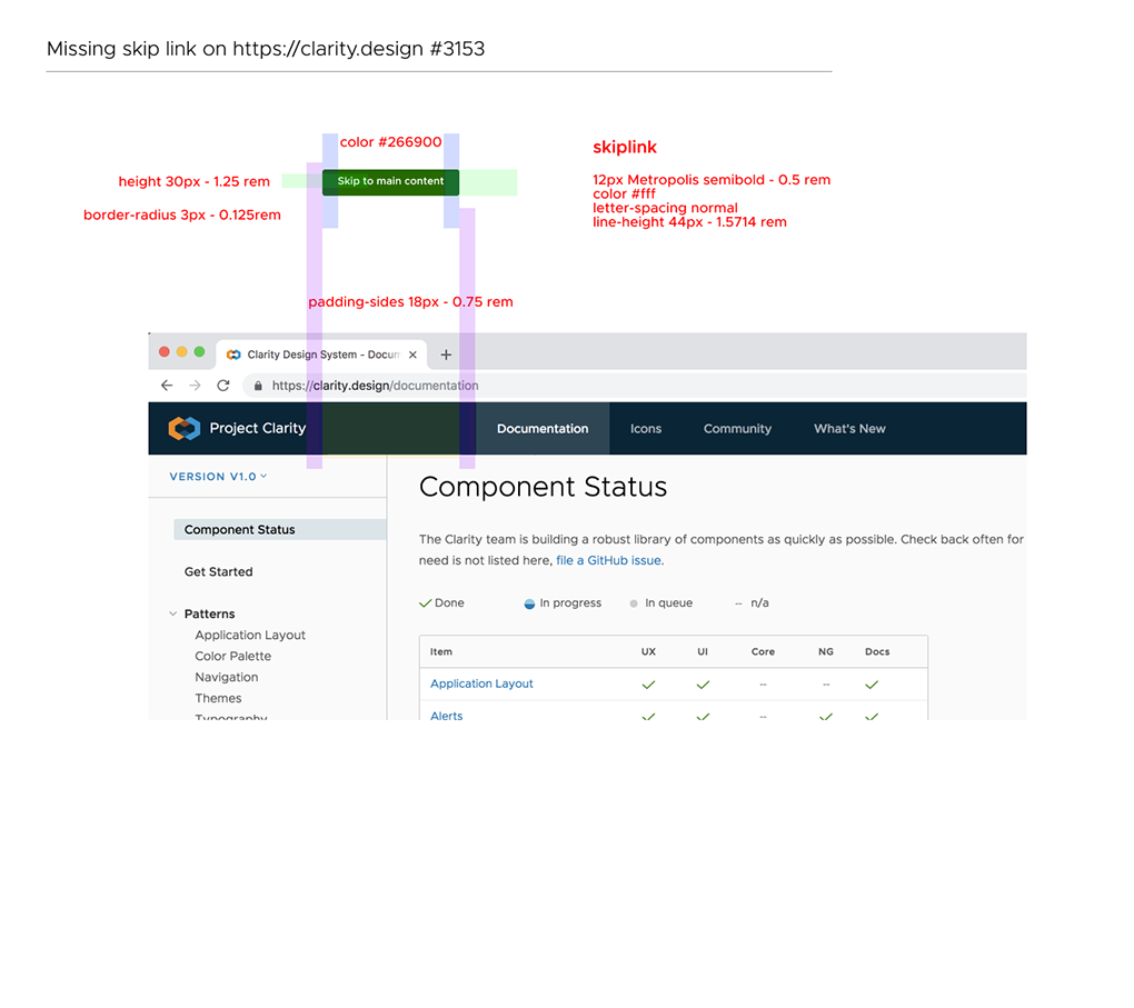
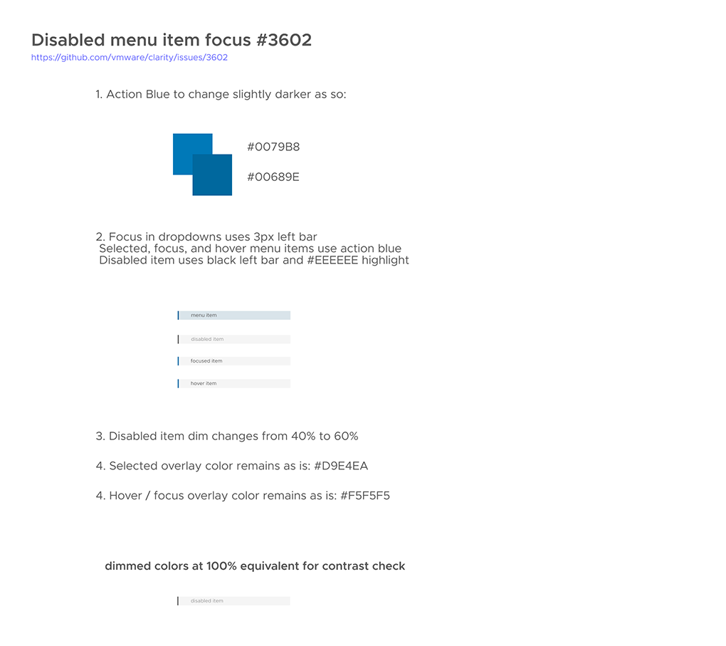
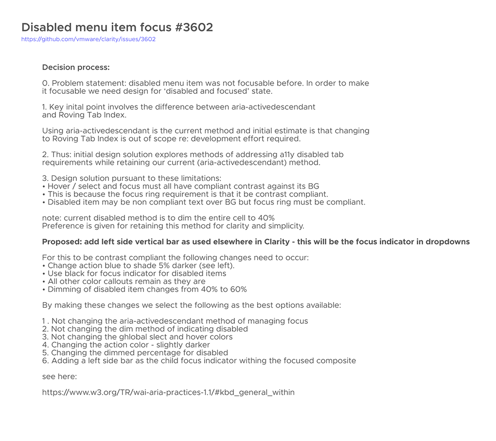
ACCESSIBILITY
Accessibility is a key aspect of everything we build. This became increasingly important with the upcoming EU requirements relative to WCAG 2.1 - we needed to make substantial changes to Clarity, and to all the products using Clarity. There are multiple versions of Clarity in use, and many products use their own (non-Clarity) components and overrides. The task was to make Clarity as compliant as possible, consequently assisting all VMware products dependent on Clarity.
We hired an accessibility team and soon had many a11y bugs to address. This is a fulfilling place to devote ones energy. Everyone should be able to avail themselves of the power of computing regardless of special needs. A11y goes far beyond simply checking and ensuring compliance for contrast ratios, but also covers ensuring screen reader, keyboard, and other interface paradigms work correctly. Accessibility is such an important aspect of UI design and development.
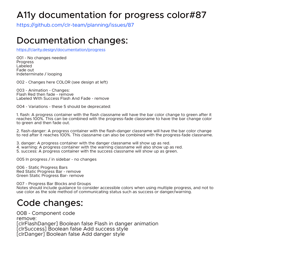
Accessibility work and documentation:


Design token based layout utilities
Many initial components were built hastily and may demonstrate inconsistent padding and margins. This is exacerbated by the previously mentioned line-height conventions. These made layout a consequence rather than a result of intent, and designers were often upset with how their work was implemented by development. Without some utilities to address this the only (unrealistic) alternative was to edit the properties of components piecemeal in order to finesse layout. I introduced a design token based layout utility as a way for designers to better embrace gestalt principles to control hierarchy. This system makes it easy for developers to follow the layout specified in the designs.
OTHER REFINEMENTS
Theming
At first my suggestion for inclusion of theming met with resistance. The thinking was that we didn’t want designers or engineers customizing our UI components that are designed to create unity. In principle I agree and have experienced the liability a lack of restraint can be. In a perfect world, themes are owned by people with the skills, experience, and time required to make solid ones. Over time the concept gained traction and became a system of custom properties that allows us to leverage ideas such as the design tokens I mention above. Much of this was due to the benefits theming provides in the realm of white-labeling / customer branding, and a11y.
Containers
We had a few issues with overt containers. Several of the legacy applications were built by developers, and the go-to solution for solving grouping requirements was to put elements in containers (cards). This became a stylistic attribute of our applications and Clarity itself. The cognitive load of so many keylines defining bounding boxes was too much. As part of a cleaner look I removed all unnecessary line work which resulted in a more fresh and light feel.
Below is a before and after of 3 components with unnecessary container attributes removed.
Office Hours
Since Clarity supports nearly 100 products and the questions coming though on Slack and email can be overwhelming I instituted the practice of holding office hours. This is a forum where teams can come ask questions, request guidance in using a component or solving a use case, or simply listen to the team and I discussing the current initiatives. Clarity Office Hours have been well received and well attended with the added benefit of giving me insight into the design challenges faced bt product teams. A design system is a 2-way street and I am grateful for all I have learned about our products from the designers who are improving them on a daily basis.
Summary
The Clarity team is a group of creative developers and designers. I am happy to have the opportunity to work with them. It is remarkable how we continue expanding the difficulty of the challenges we tackle, while keeping up a rapid cycle of enhance, iterate and release. I have been able to lend my design skills to the effort while learning much about front end development and accessibility. I'd encourage anyone unfamiliar with our work, especially those interested in design systems, to visit clarity.design - the project is open source and available to anyone who wants to study our system or use our components.
Get in touch:
Get in touch: