Warner Brothers
& Marvel
WARNER BROTHERS
& MARVEL
The Dark Knight Rises and The Avengers
MOBILE COMPANION APPS
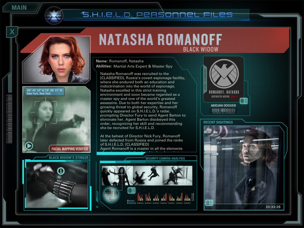
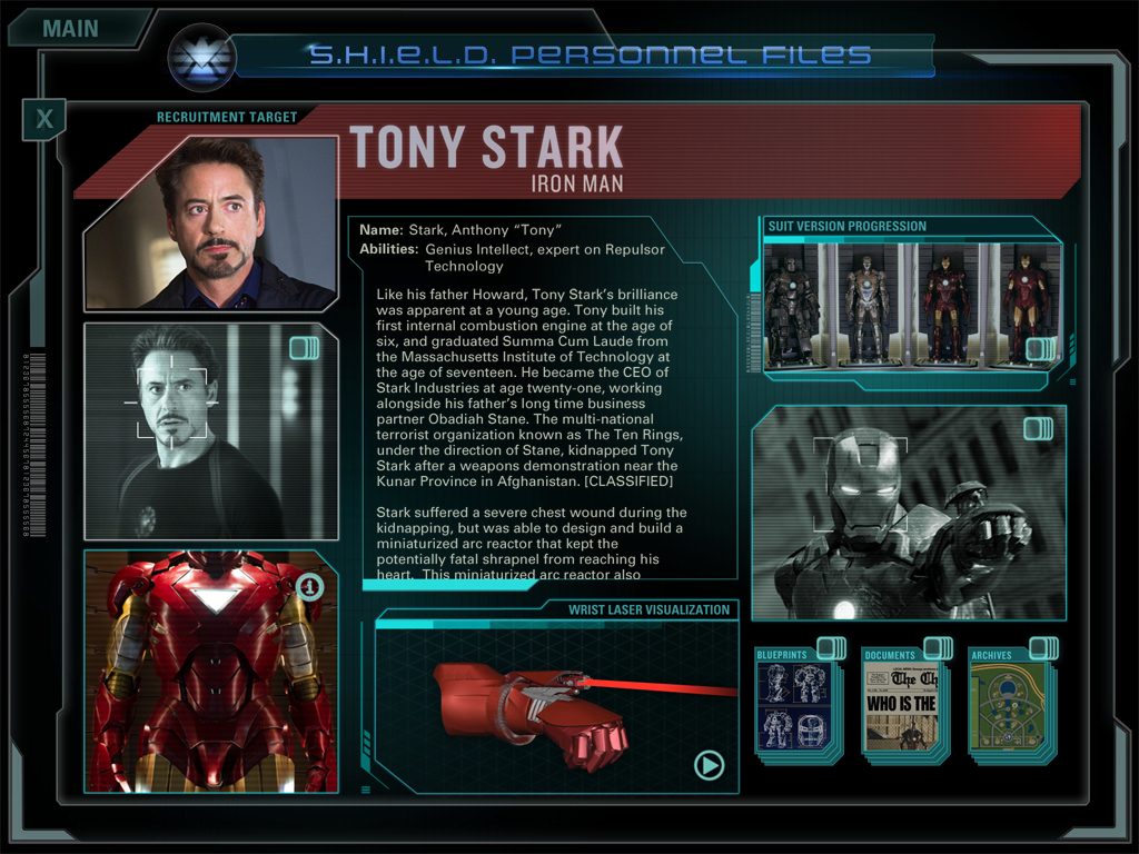
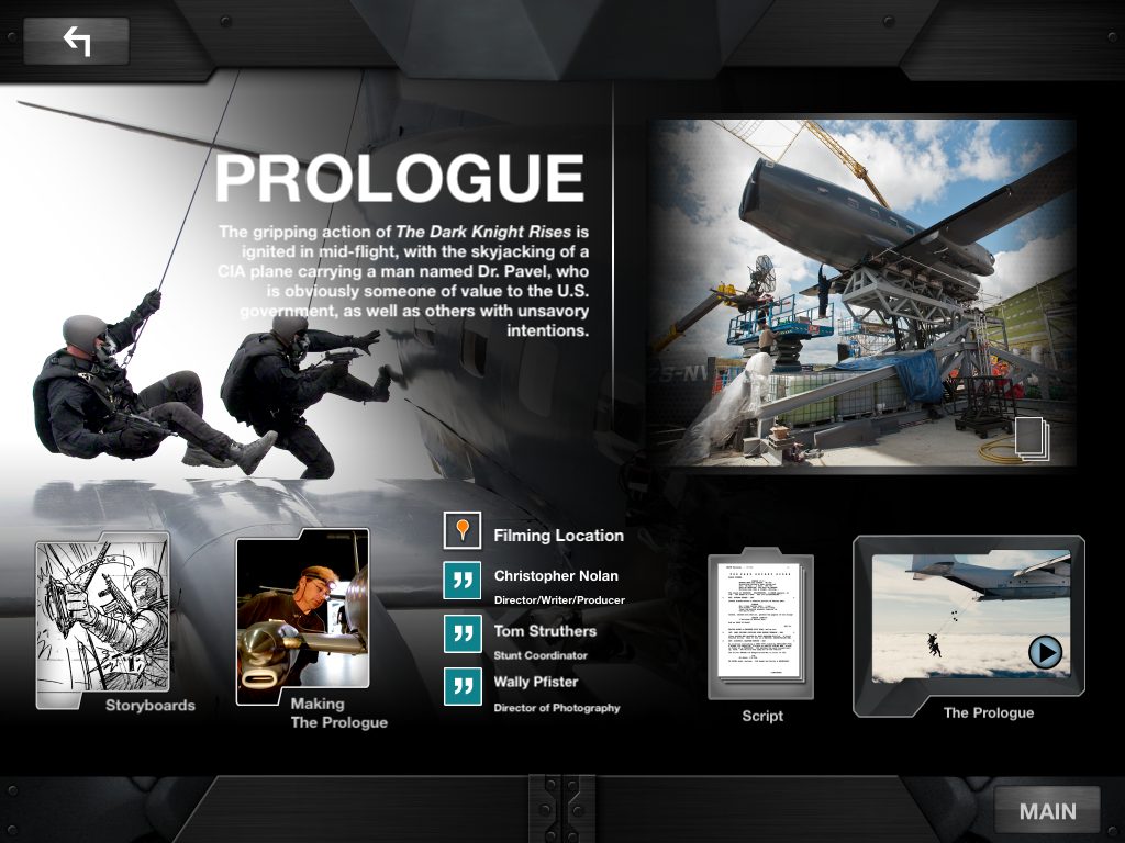
These are promotional apps for the Blue Ray releases that include bonus clips and extras that once unlocked, sync with the film through Blue Ray live. I came to apply my feature film visual effects sensibilities to these apps. The design reflects an effort to harmonize with the look and feel of the film while presenting material in a wholly different format.
These are promotional apps for the Blue Ray releases that include bonus clips and features and extras that once unlocked, sync with the film through Blue Ray live. I came to apply my feature film visual effects sensibilities to these apps. The design reflects an effort to harmonize with the look and feel of the film while presenting material in a wholly different format.

DISCOVERY and EXPLORATION
DISCOVERY and EXPLORATION
These apps are for the real fans, those who are going to download the app before the Blu-ray releases, and unlock the extras when they have the disc. Including a lot of extras was important. Defining our visual language was a pleasant task since these films are so stylized and full of visual effects and futuristic UI. The films themselves provided ample inspirational material.
These films being full of visual effects and futuristic UI made the task of defining our visual style a plesant one. The long legacies of the characters going back in comics provided ample additional material.
DESIGN
DESIGN
I took the initial pass at the designs shown below, and then with my team of talented designers we worked through all the variations and client feedback until we achieved a cohesive look and feel.
These films being full of visual effects and futuristic UI made the task of defining our visual style a plesant one. The long legacies of the characters going back in comics provided ample additional material.

CHALLENGES
CHALLENGES
One of the most interesting and difficult aspects of this project was the lack of interaction design. The goal was to present as much beautiful and compelling imagery as simply as possible and using clever interaction or conditional logic was out of scope. Providing access to all the content through a simple home and back paradigm drove a lot of the design decisions.
One of the most intersting and difficult aspects of this project was the lack of interaction design. The goal was to present as much beautiful and compelling imagery as simply as possible and using and clever interaction or conditional logic was out of scope. Providing access to all the content through a simple home and back paradigm drove a lot of the design decisions.
Get in touch:
Get in touch:


