Guidewire
GUIDEWIRE
MODULAR DESIGN SYSTEM
MODULAR DESIGN SYSTEM • ART DIRECTOR
Guidewire is an industry leading provider of software to the property and casualty insurance industry worldwide. Growing to more than 2,000 employees in 18 different offices, and more than 350 customers spanning 13 countries, it was time for a unifying and contemporary design system.
I led the effort to create Guidewire's design language. We started from square one - every application prior to the advent of our design language was built as a one off. Our system now provides design, product, and development with a rich and flexible set of UI tools to quickly prototype, build, configure, and theme UI for the entire company.
Guidewire is a $4B provider of software to the property and casualty insurance industry worldwide. With more than 2,200 employees in 18 different offices and more than 350 customers spanning 13 countries, it was time for a unifying and contemporary design system.
I led the effort to design Guidewire's componentized design language. We started from square one - every application prior to the advent of our design language was built as a one off from the ground up.
Our system now provides design, product, and development with a rich and flexible set of UI tools to quickly prototype, build, configure, and theme UI for the entire company.
UX VISION
UX VISION
When I joined this rapidly expanding company it became immediately apparent that we needed leadership for our flat hierarchy of a dozen co-equal UX designers supporting so many products. Through a great deal of diplomacy and several presentations, my initiative eventually gained momentum and support at all levels of the organization and became known as UX Vision.
When I joined this rapidly expanding company it became immediately apparent that we needed leadership for our flat hierarchy of a dozen co-equal UX designers supporting so many products. Through a great deal of diplomacy and several presentations, my initiative eventually gained momentum and support at all levels of the organization and became known as UX Vision.

BUILDING SUPPORT
BUILDING SUPPORT
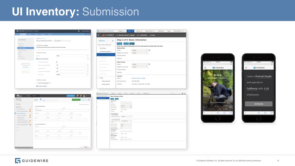
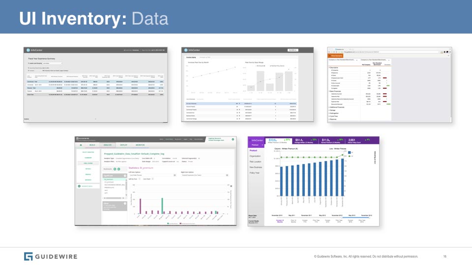
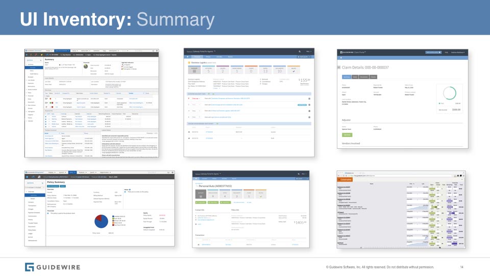
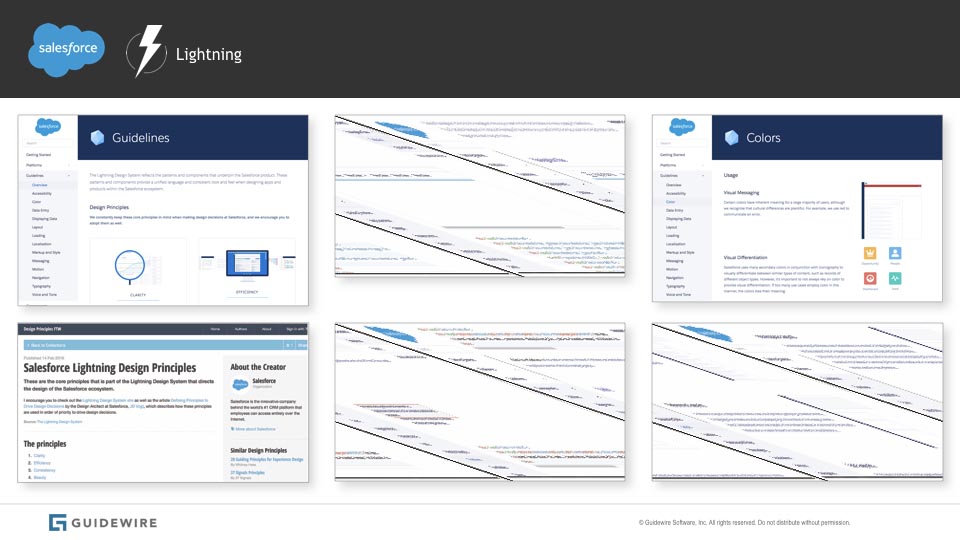
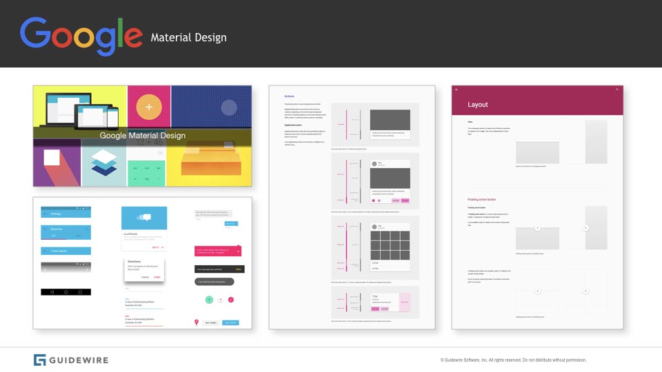
The first challenge with an organization unaccustomed to a unified process for design was that of selling the idea to a critical mass of stakeholders. I decided that rather than trying to pitch the solution I'd focus on a competitive analysis approach. I did a survey of our products then contrasted the results with what a systematic approach brings to other companies.
I made several presentations to groups from the architecture review board to business owners, marketing, and product management. By contextualizing our diversity in relation to the consistent elegance elsewhere, the decision made itself and we had the support we needed.
The first challenge with an organization unaccustomed to an integrated process for design was simply that of selling the idea to a critical mass of stakeholders. I decided that rather than trying to pitch the solution I'd focus on a competitive analysis approach - we did a survey of our products and then looked at what a systematic approach brings to other companies.
I made numerous presentations to groups from the architecture review board to business owners, marketing, and product management. By contextualizing our diversty in relation to the consistent elegance elsewhere, the decision made itself and we had the support we needed.
Presentation to stakeholders:


BIRDSEYE VIEW
BIRDSEYE VIEW
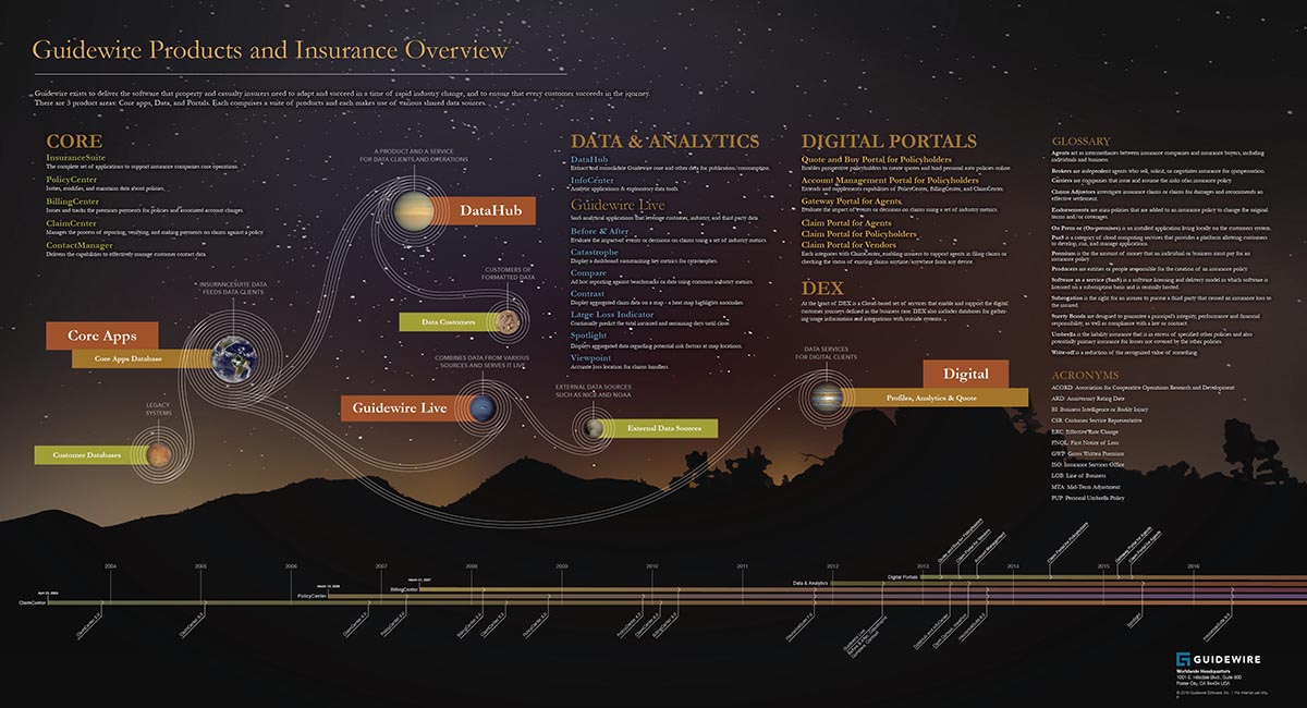
Having secured the support of the organization, my next task was to get a grip on the sprawling ecosystem of diverse yet connected products. By interviewing people across disciplines and in all of the recent acquisitions, I was able to visualize a systems architecture that covered all the products, subdivided by their families, and delineating the ways their data structures were interconnected. I created a timeline to show the evolution of this system as well as a glossary including a collection of terms and acronyms. The result was an infographic which is displayed throughout our numerous offices. HR is fond of sharing it with new hires as part of their orientation.
Having secured the support of the organization, my next task was to get a grip on the sprawling ecosystem of diverse yet connected products. By interviewing people across disciplines and in all of the recent acquisitions, I was able to visualize a systems architecture that covered all the products, subdivided by their families, and delineating the ways their data structures were interconnected. I created a timeline to show the evolution of this system as well as a glossary including a collection of terms and acronyms. The result was an infographic which is displayed throughout our numerous offices. HR is fond of sharing it with new hires as part of their orientation.
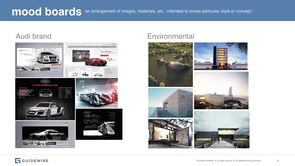
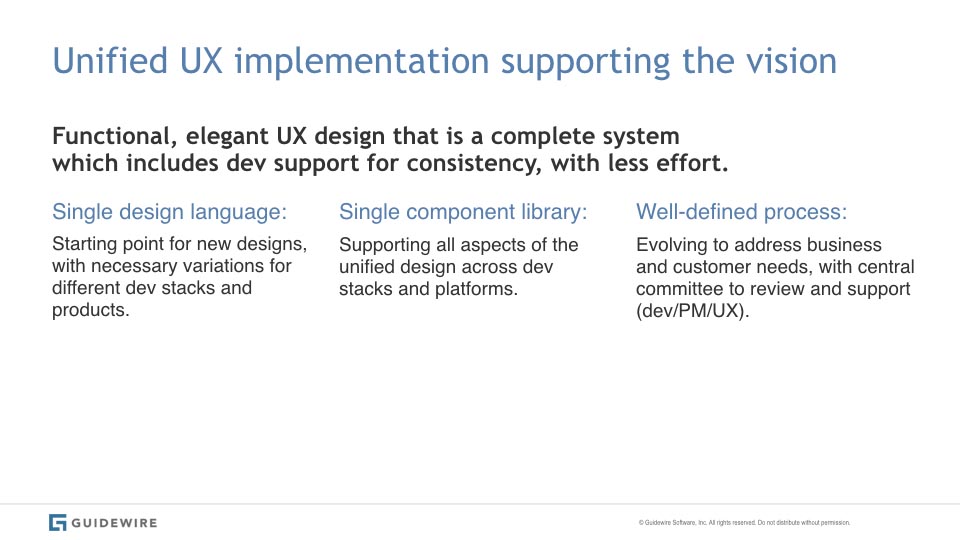
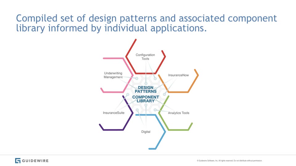
Design Language and Tactics
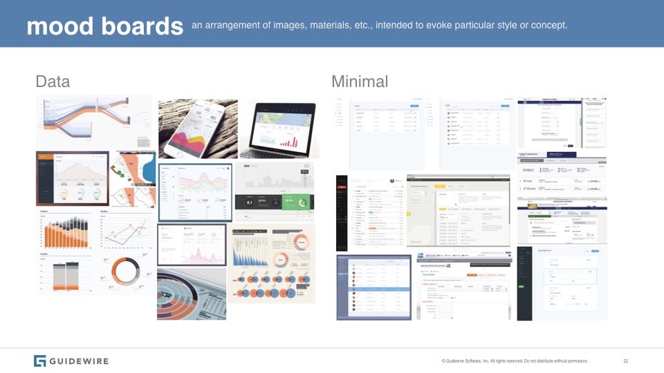
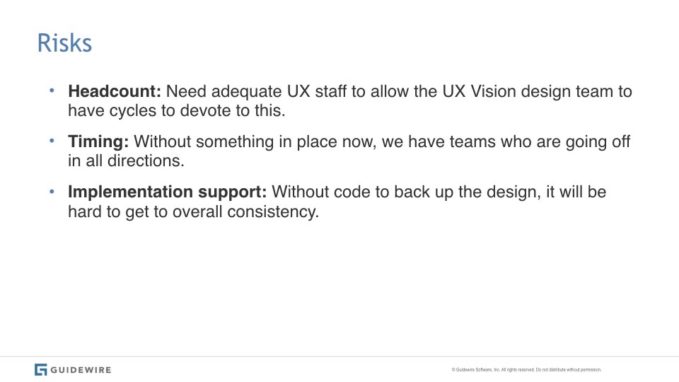
Competitor and same space / non-competitor discovery, mood boards, and a systematic deconstruction of all our products resulted in the next deck I presented to our stakeholders. Here I showed where we were, and where we intended to go based on their guidance. This functioned as a vision for how we would achieve a the desired benefits, how development would participate, along with risks, timing, and headcount assessment.
Competitor and same space / non-competitor discovery, mood boards, and a systematic deconstruction of all our products resulted in a deck I presented to our stakeholders showing where we were and where we intended to go based on their guidance. If the initial analysis that showed where we were and where others using a design language had gotten was the antecedent, this functioned as the consequent. Very important was a tactical plan for how development was to participate along with risks, timing, and headcount assesment.


MVP
MVP
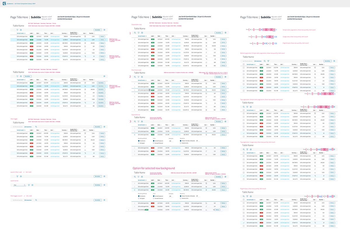
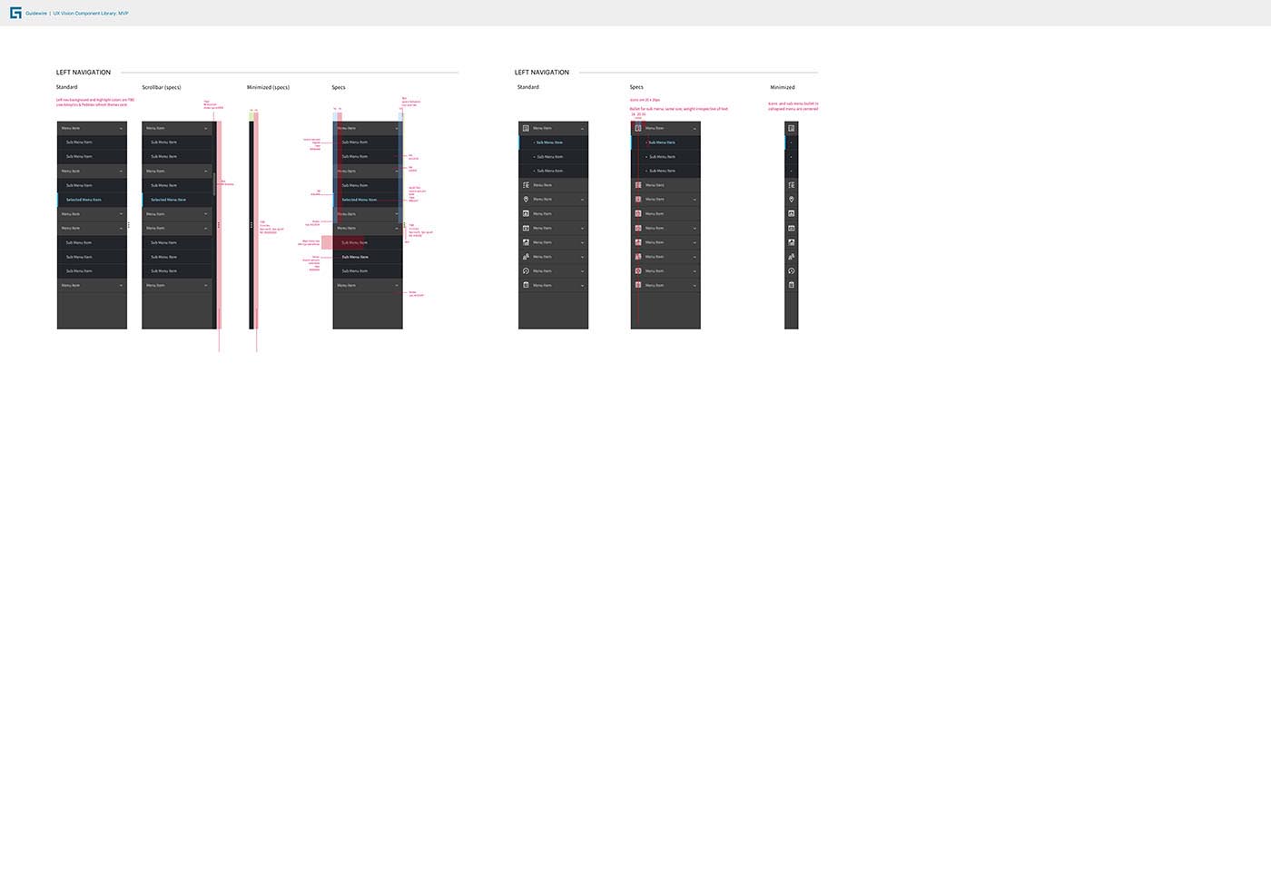
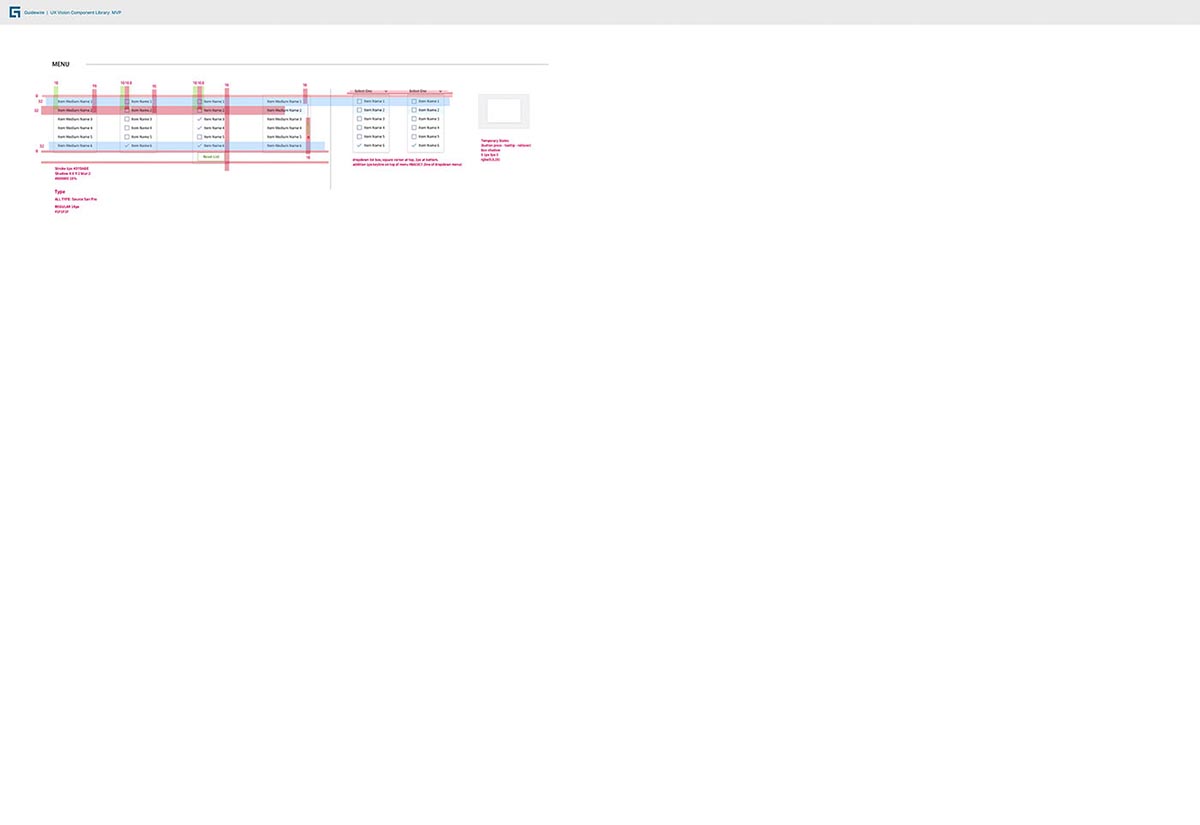
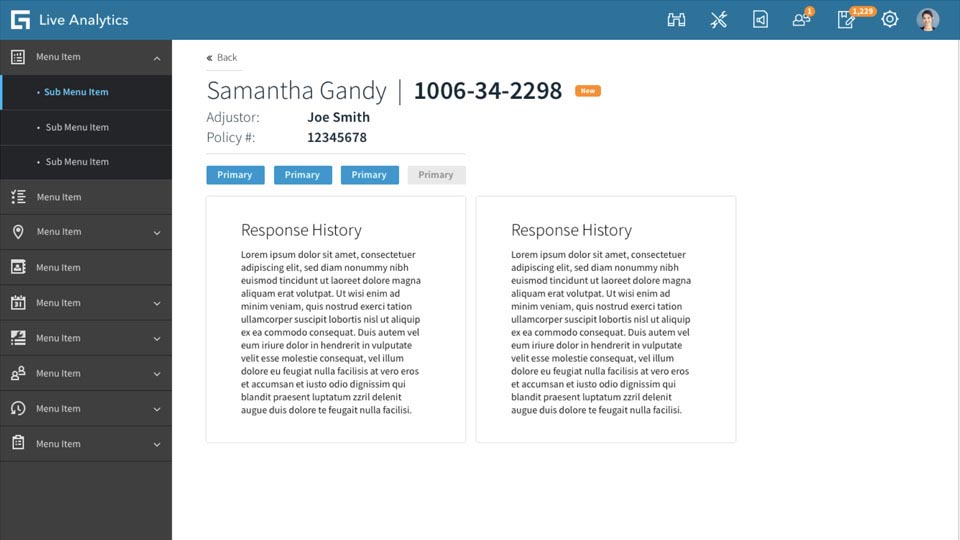
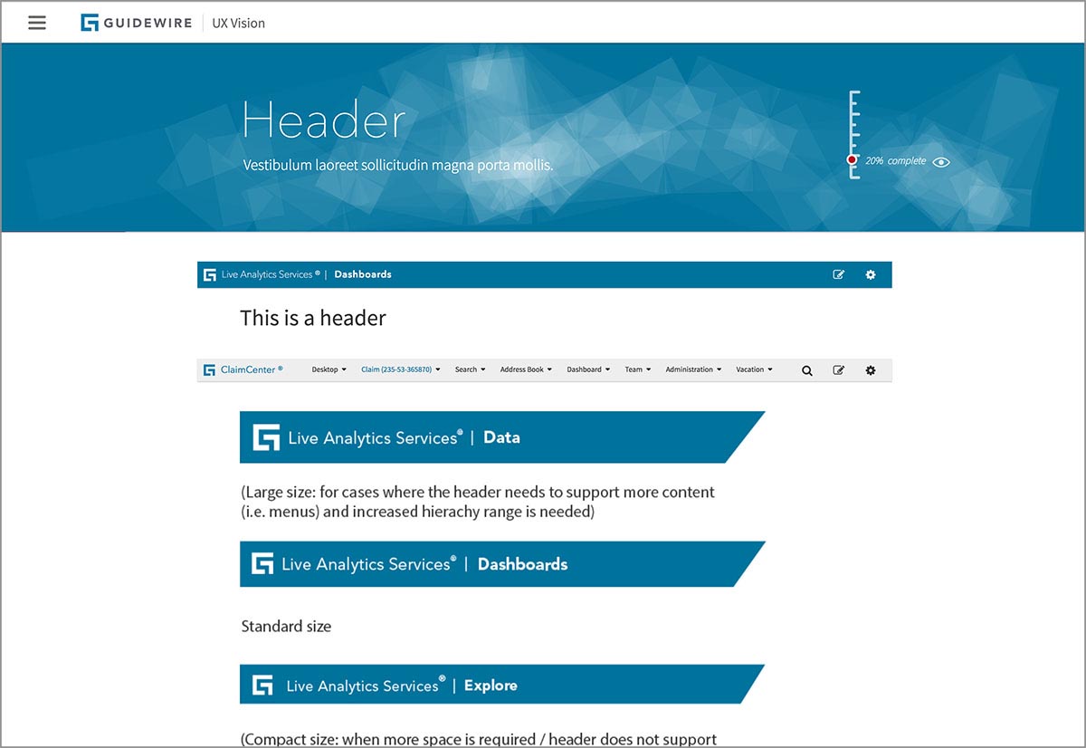
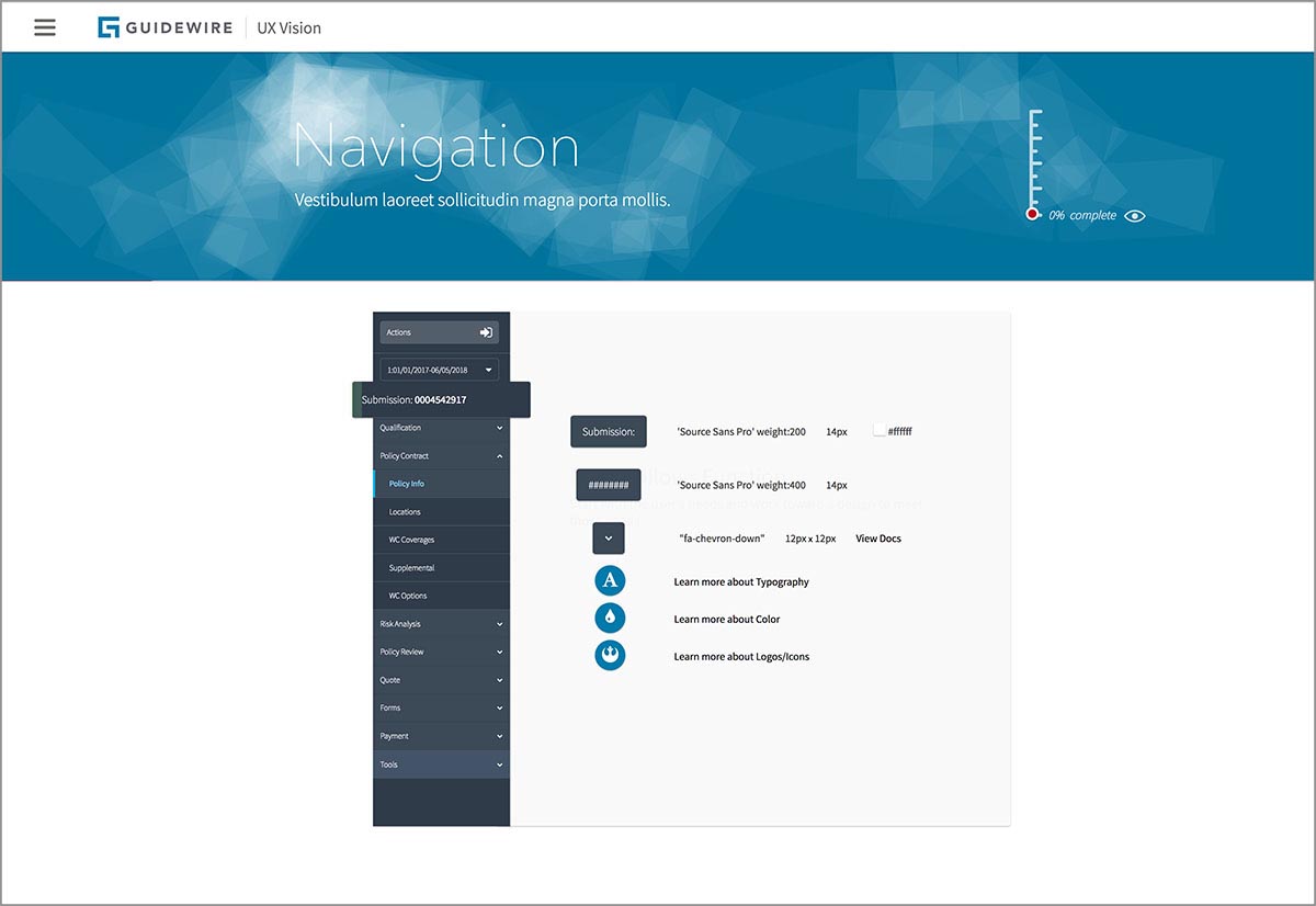
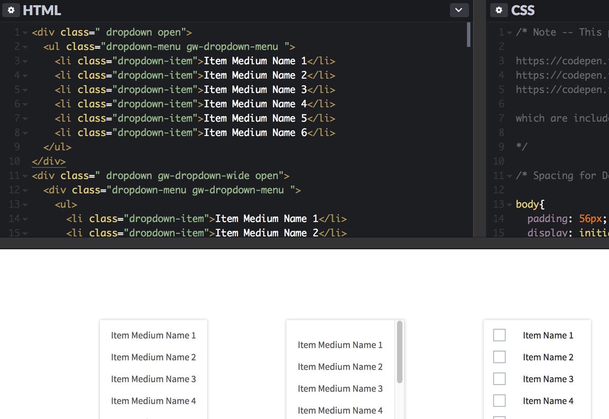
We did eventually get to doing actual design... all the preparation was invaluable in determining what we needed to build and which pieces required a lot of detailed configurable functionality, and ones where a standard implementation would suffice. Data tables proved to be one of the biggest projects. Guidewire's customers consume data voraciously. All UI's feature tables of one sort or another, all having different needs. To get some idea of the magnitude of this component, there are more than 100 different tables across our product line known as list view, data grid, and table depending on who you ask and which product. All feature a lot of complex functionality. This is one example of the large task of creating flexible and configurable components for our suite of products.
We did eventually get to doing actual design... all the preparation was invaluable in determining what we needed to build and which pieces required a lot of detailed configurable functionality, and which ones we should get a minimum viable placeholder for. Data tables proved to be one of the biggest projects. Guidewire's customers consume data voraciously. All UI's feature tables of one sort or another, all having different needs. To get some idea of the magnitude of this component, there are more than 100 different tables across our product line known as list view, data grid, and table depending on who you ask and which product. This is one example of the enormous task of creating flexible and configurable componentry for our suite of products.
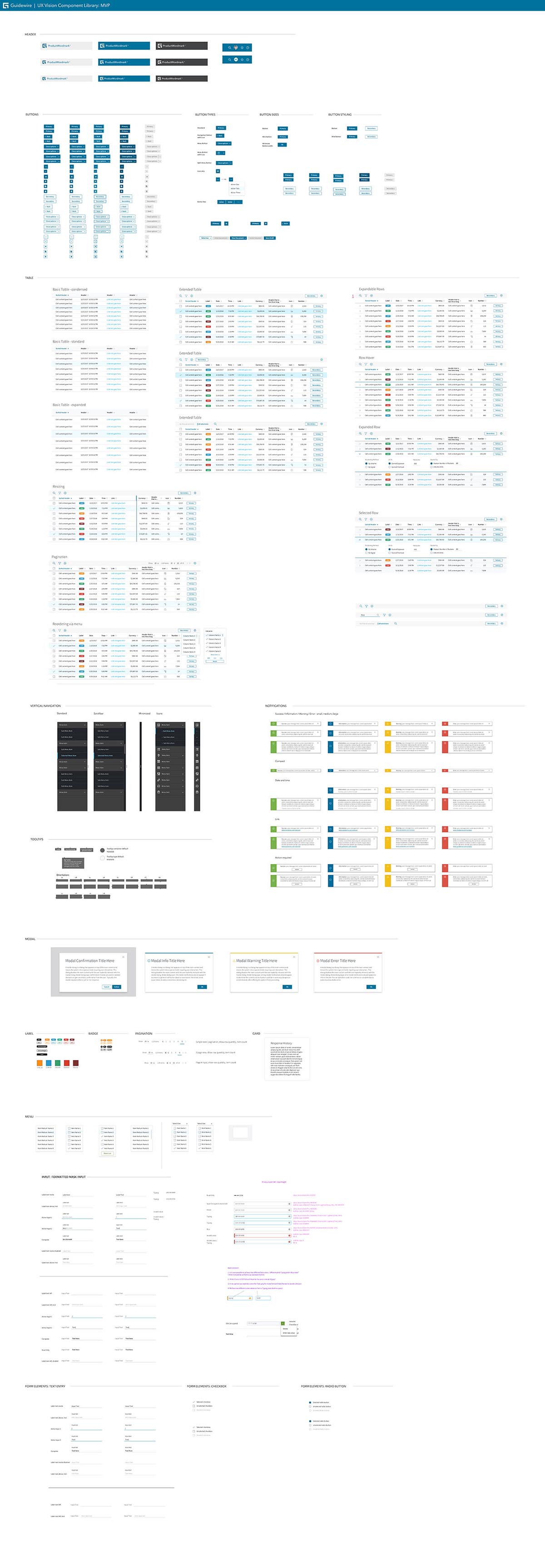
Selected patten and component specifications:
THEMING
THEMING
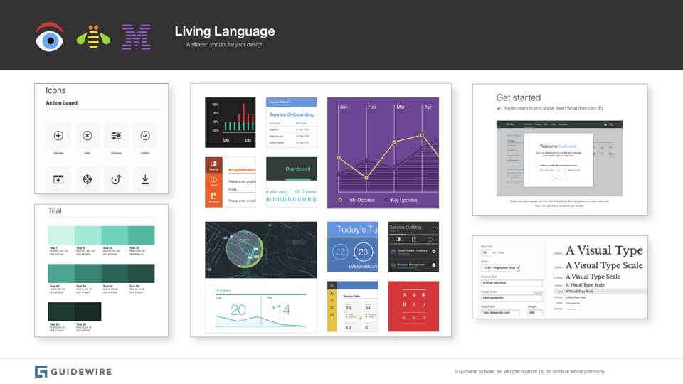
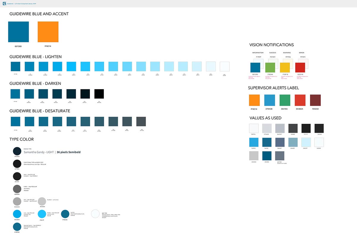
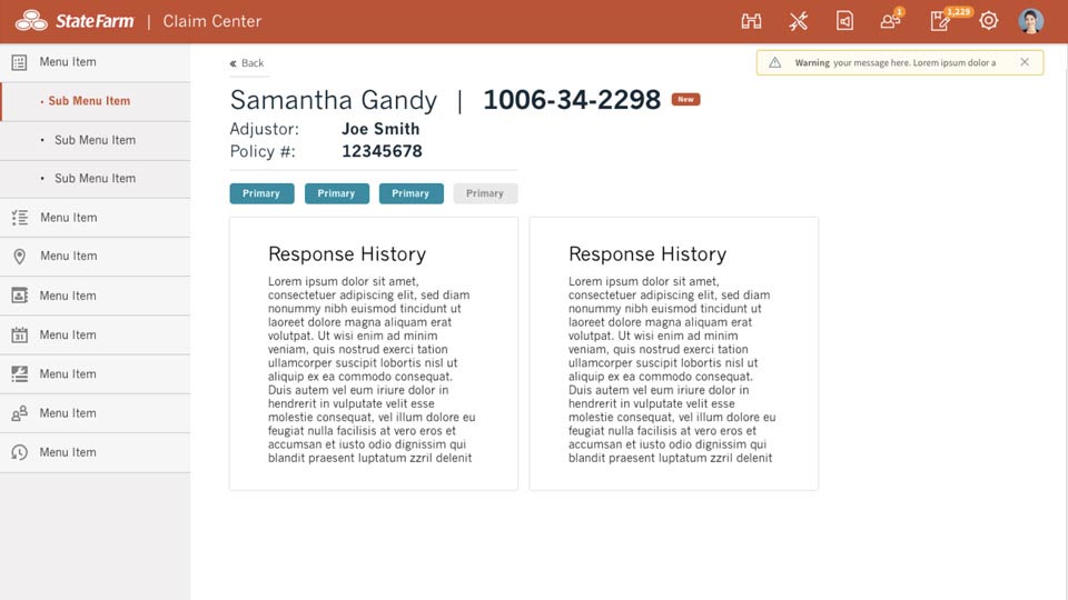
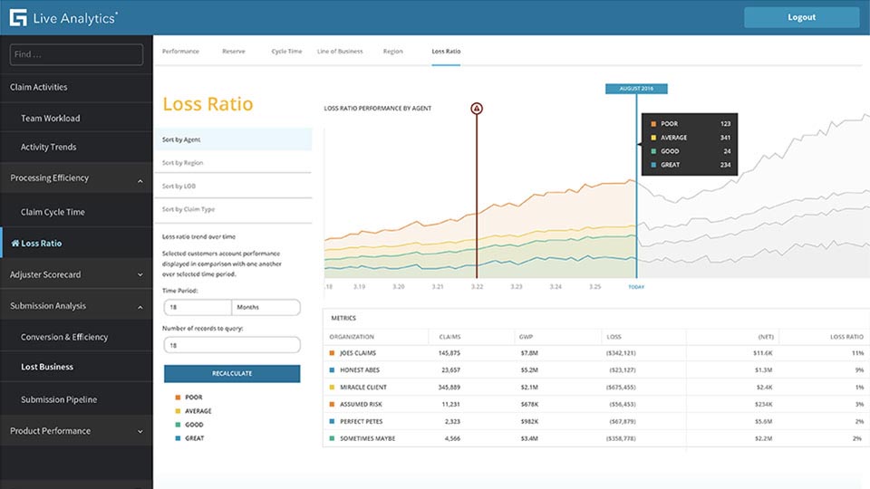
I determined that theming was the only way to make a system that was simultaneously sufficiently flexible and sufficiently consistent. Working on theming and extending the possibilities of a component system was one of the most creative and rewarding aspects of this project. We started building useful components with baked in styling in order to establish our baseline - this became out OOTB corporate theme and our MVP component library. Next we abstracted all the pertinent attributes from the components into a system of hierarchical style tokens that produced the same result, with the added benefit of being able to create additional themes.
I determined that theming was the only way to make a system that was simultaneously sufficiently flexible and sufficiently consistent. Working on theming and extending the possibilities of a componentized system is one of the most creative and rewarding aspects of this project. We started building useful componentry with baked in styling in order to establish our baseline - this became out OOTB corporate theme and our MVP component library. Next we abstracted all the pertinent attributes from the components into a system of hierarchical attributes that produced the same result, with the added benefit of being able to create child themes via conditional logic.
Theming examples:

MICROSITE and UI REGISTRY
MICROSITE and UI REGISTRY
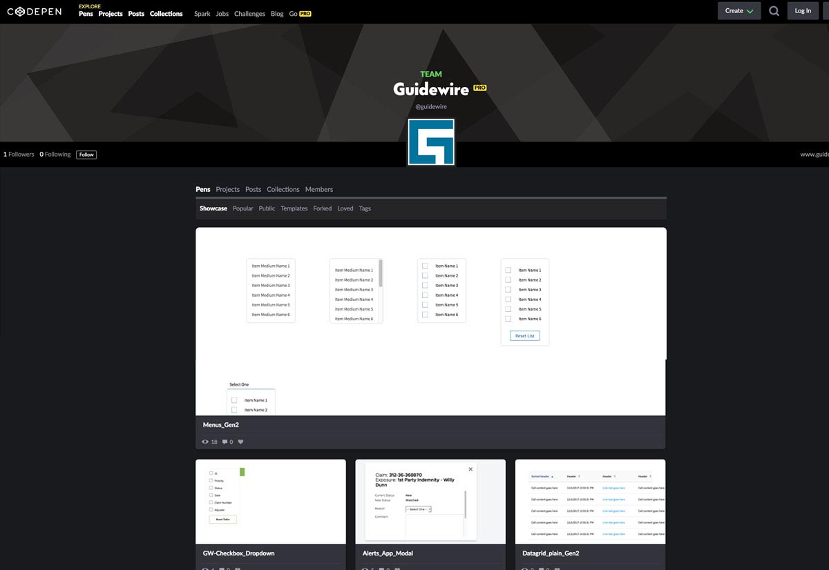
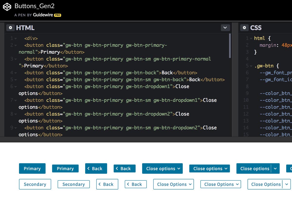
Our design system needed a home. The excellent models from Clarity to Carbon to Grommet helped me determine how we could document and provide access to our components and code. In the interim Codepen.io provided a great repository for the code, while we built a microsite for the UI components and usage notes. The next step was for these resources to be combined into a single source of truth.
One key strategy here is to be framework agnostic. Our UI architect was adamant about retaining the agility to apply an independent design language to any technology stack that might be required - this allows our design system to evolve independently of other concerns.
Our metadata driven design system needed a home. The excellent models from Clarity to Carbon to Grommet helped me determine how we could document and provide access to our componentry and code.
In the interim Codepen.io provided a great repository for the code, we built a microsite for the UI components and usage notes. The next step is for these resources to be combined into a single one.
One key strategy here is to be framework agnostic. Our UI architect was adamant about retaining the agility to apply an independent design language to any technology stack that might be required - this allows our design language to evolve independently of other concerns.
Microsite and Registry:


ICONOGRAPHY
ICONOGRAPHY
Solving for iconography across the numerous products within the arcane world of insurance concepts and terminology is no mean feat. Who knows what subrogation or reinsurance are? How about representing these in 16px glyphs? We designed a very prescriptive system with firm guidelines to preserve clarity knowing that the demands of complex concepts would create pressure for overly complex icons that were difficult to parse.
Solving for iconography across the numerous products within the arcane world of insurance concepts and terminology is no mean feat. Who knows what subrogation or reinsurance are? How about representing these in 16px glyphs? We designed a very prescriptive system with firm guidelines to preserve clarity knowing that the demands of complex concepts would create pressure for overly complex icons that were difficult to parse.
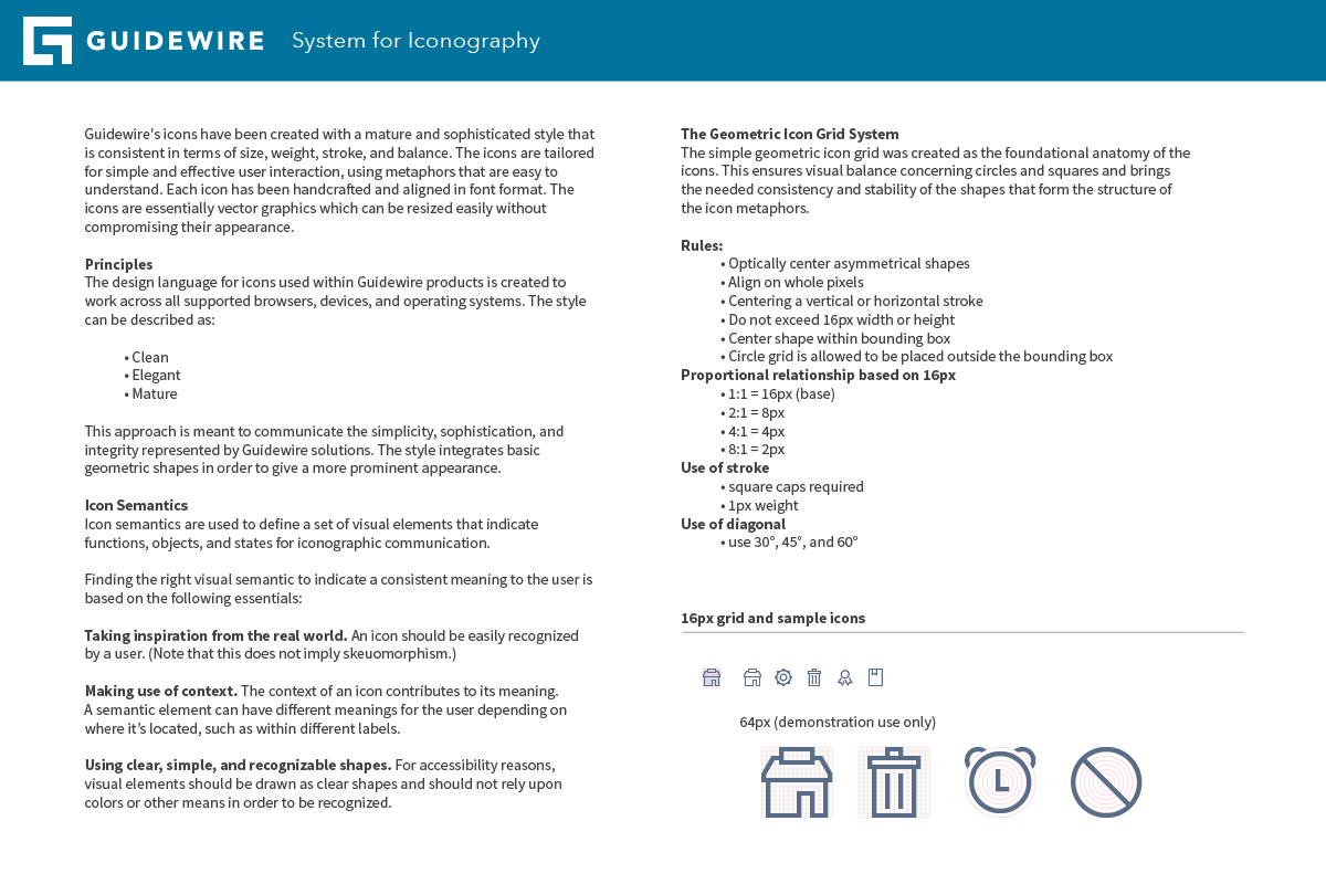
16px was necessary as the default size because the core applications are for power users who prefer density of information and despite any larger discussion of parsing of information through context and the value of air, PM decided that we wanted compact and the icons needed to read in this size.
16px was necessary as the default size because the core applications are for power users who prefer density of information and despite any larger discussion of parsing of information through context and the value of air, PM decided that we wanted compact and the icons needed to read in this size.
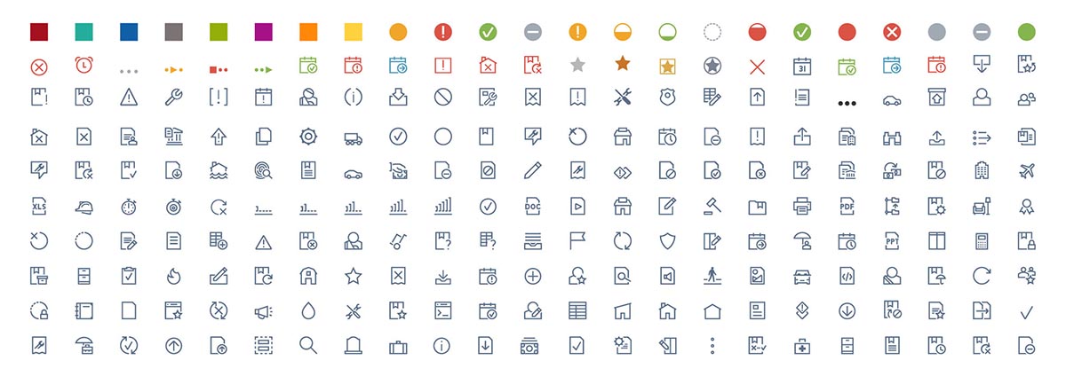
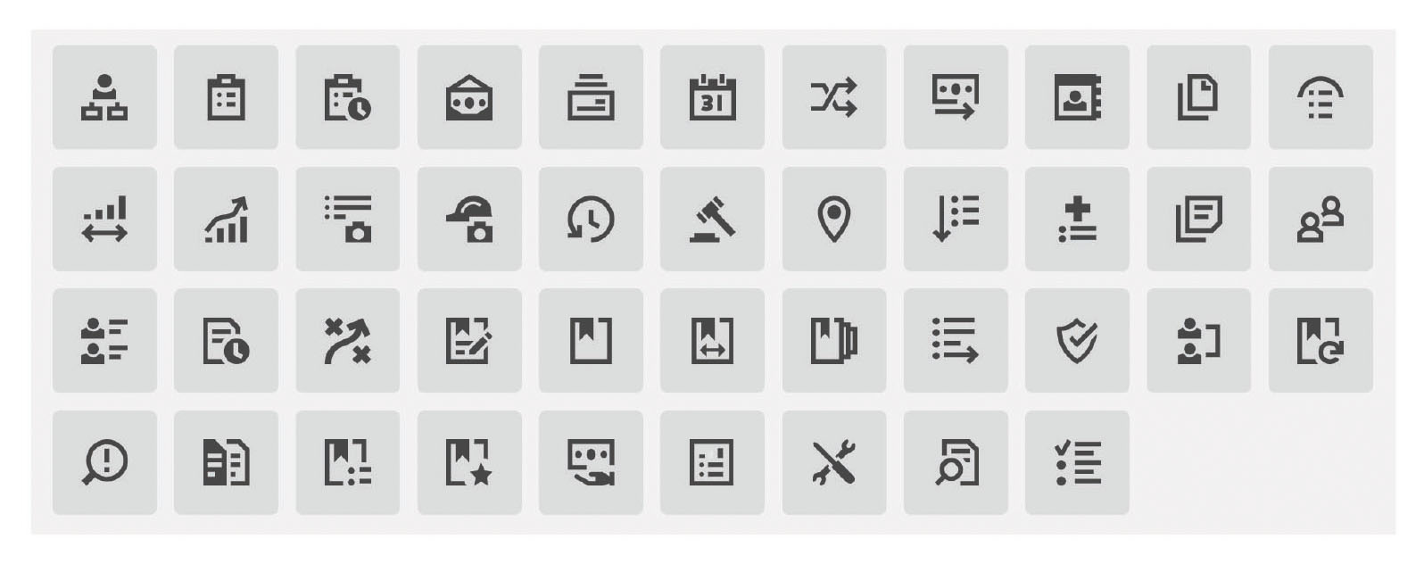
Our iconographic design systems allowed us to construct icons such that we could retain consistency not only across the product lines but in cases where the set would be inherited by new designers for additions and variations. We expanded the rules of our iconography system to create a set of mid-sized display icons for use in navigation.
Our iconographic design systems allowed us to construct icons such that we could retain consistency not only across the product lines but in cases where the set would be inherited by new designers for additions and variations. We expanded the rules of our iconography system to create a set of mid-sized display icons for use in navigation.
CONTINUATION
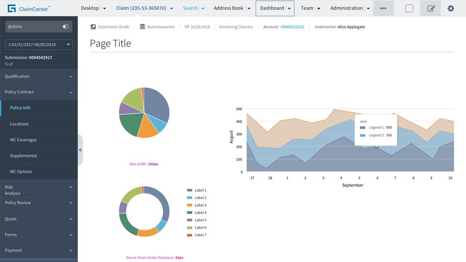
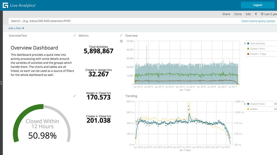
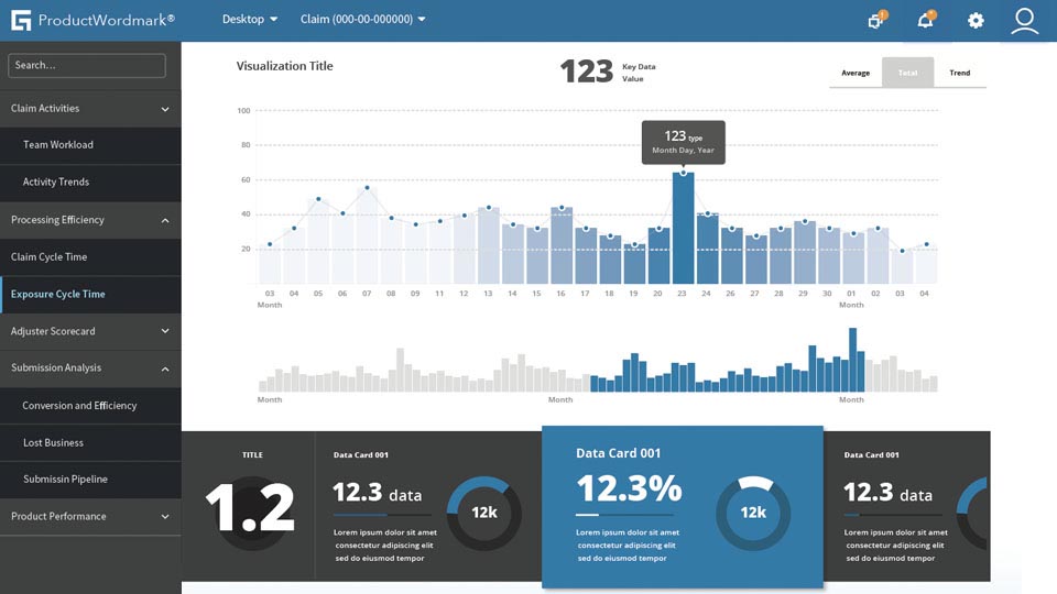
The challenge and complexity of a cohesive design system is not to be taken lightly. Add the complexity of an innovative company spread all over the globe, with countless stakeholders passionate about their products, and one is in for a big adventure. The UX Vision work continues at Guidewire as new products with different needs emerge, and my team and I are excited about building dynamic data visualizations with D3.js as an innovative addition to our modular system.
The challenge and complexity of a cohesive design system is not to be taken lightly. Add the complexity of an innovative company spread all over the globe, with countless stakeholders passionate about their products, and one is in for a big adventure. The UX Vision work continues at Guidewire as new products with different needs emerge, and my team and I are excited about building componentized dynamic data visualizations with D3.js as an innovative addition to our modular system.

Get in touch:
Get in touch: